The Big Idea
The big idea is weaving the shop’s core product story—vintage records—into the brand’s visual identity, so the identity feels authentic and tactile. We are using actual record and turntable parts as design elements to signal craft, history, and quality.
Project: Twelves Wax Record Store Identity
Problem
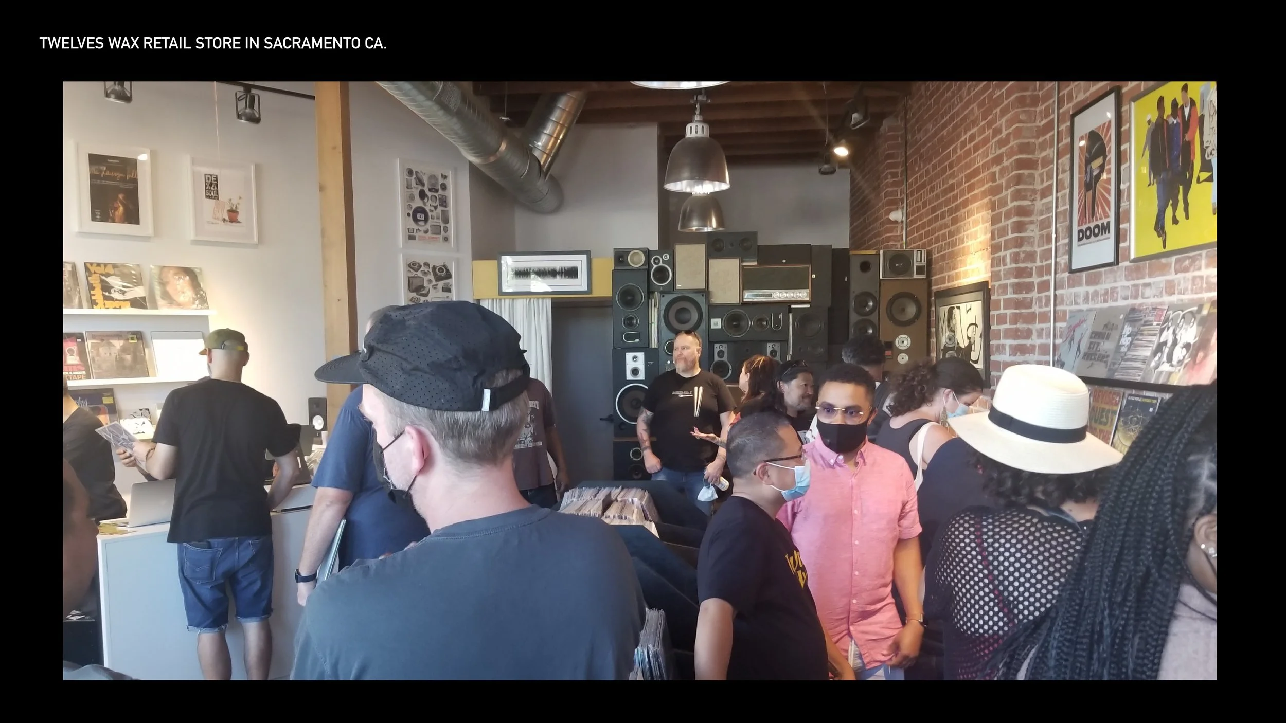
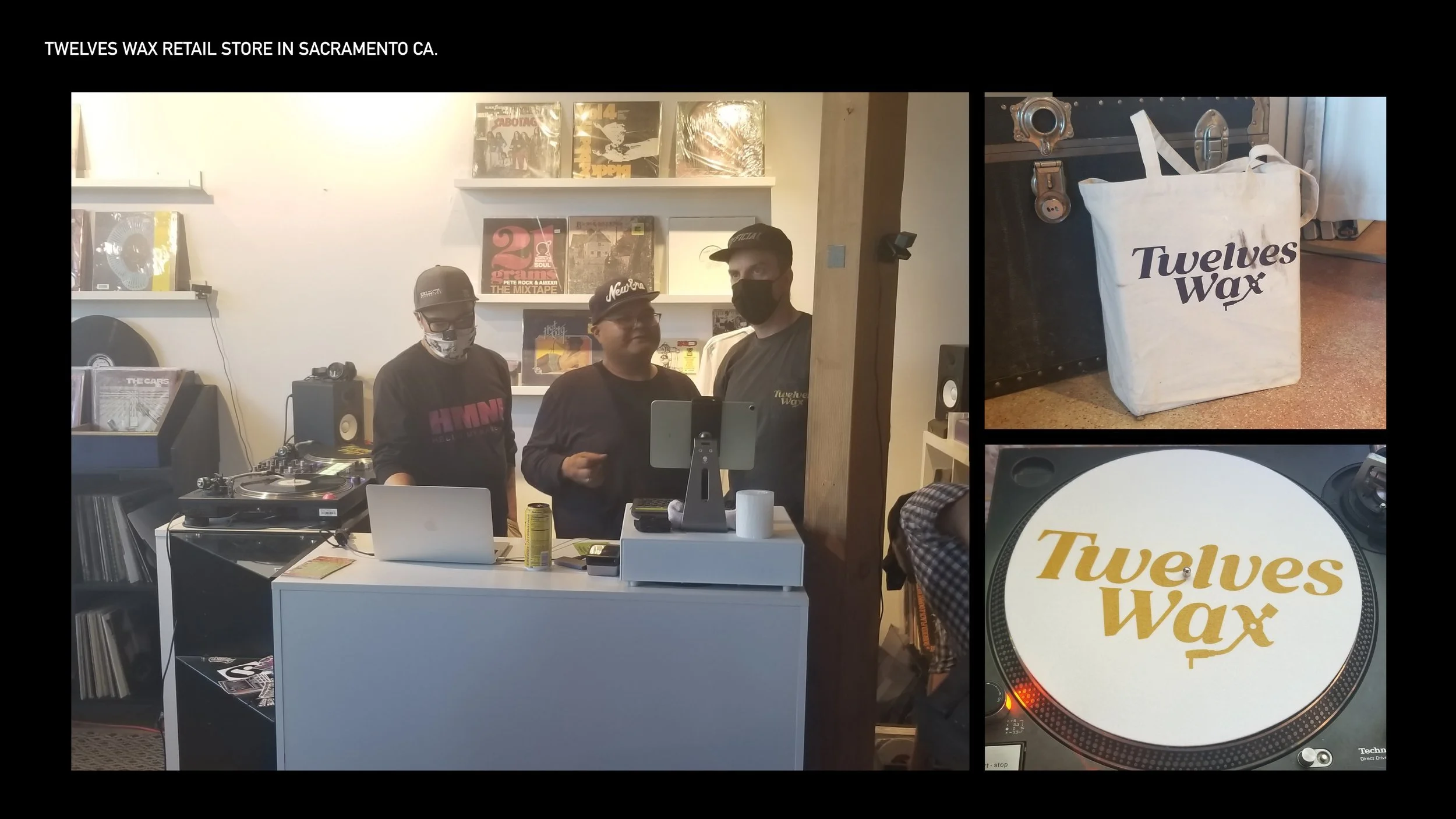
The owners of the record shop needed an identity system for their brick-and-mortar store. That included a logo, icon, style guide, and environmental signage. This record store is a staple of the Oak Park area, owned by staple Sacramento community members. They have been laying the groundwork for over fifteen years in the communal arts and music scene.
Project Goal
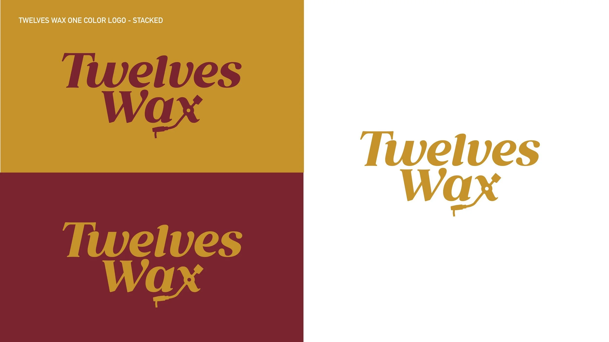
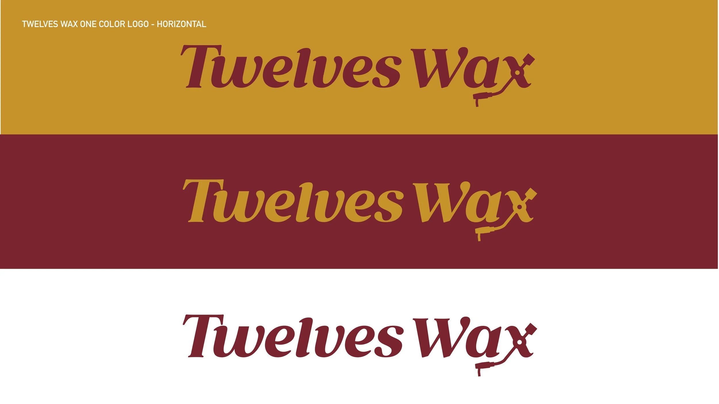
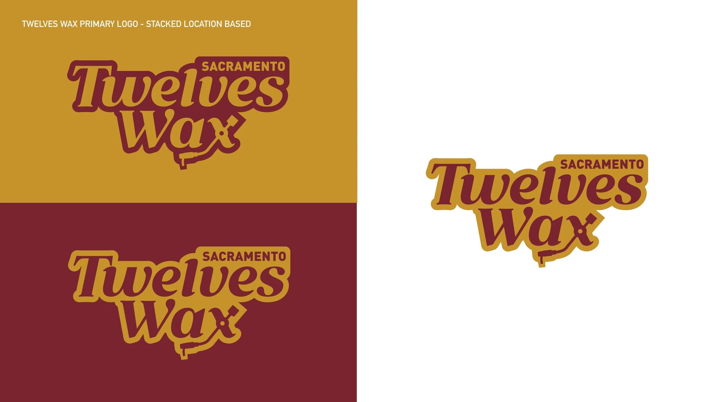
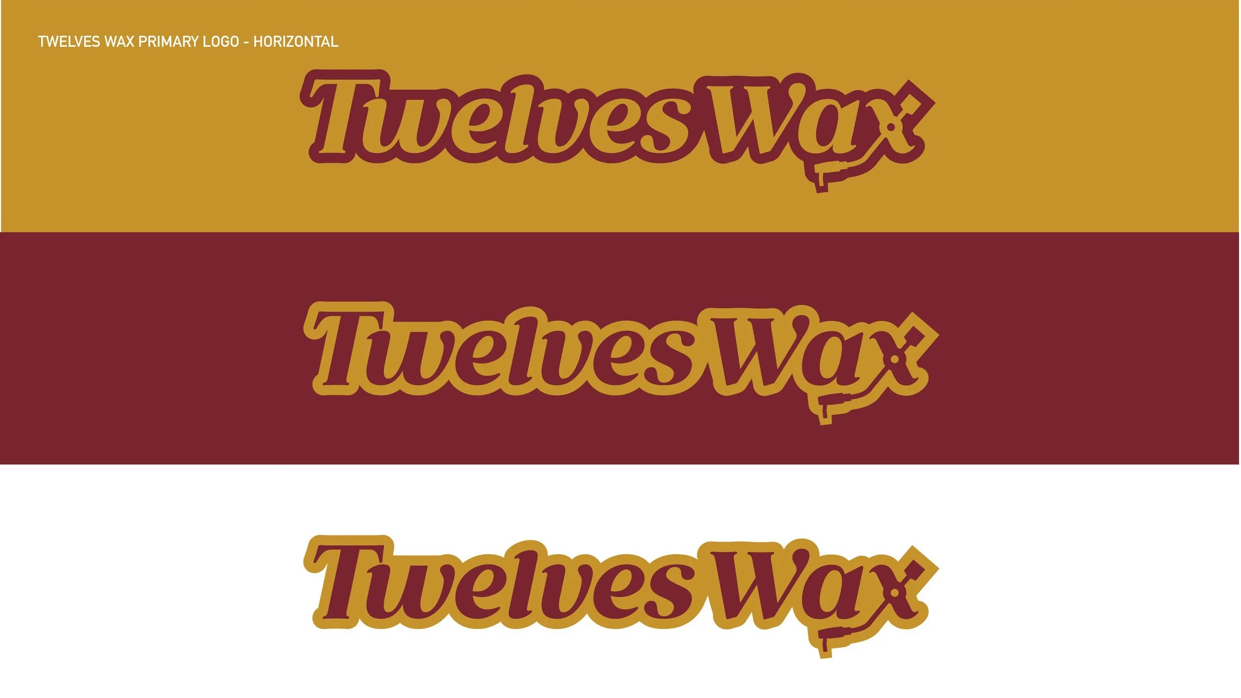
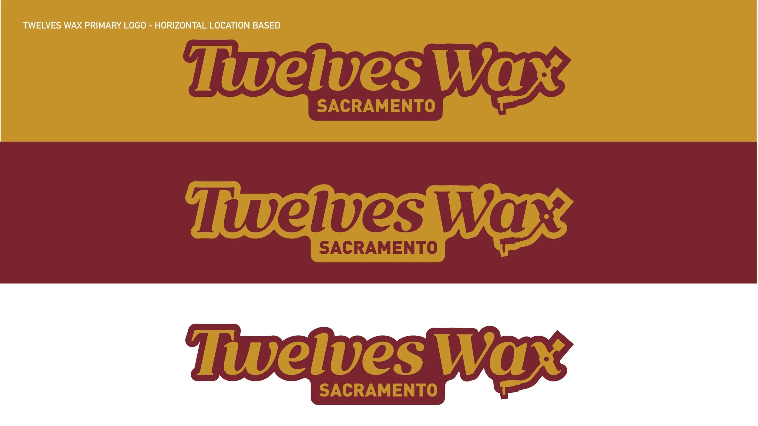
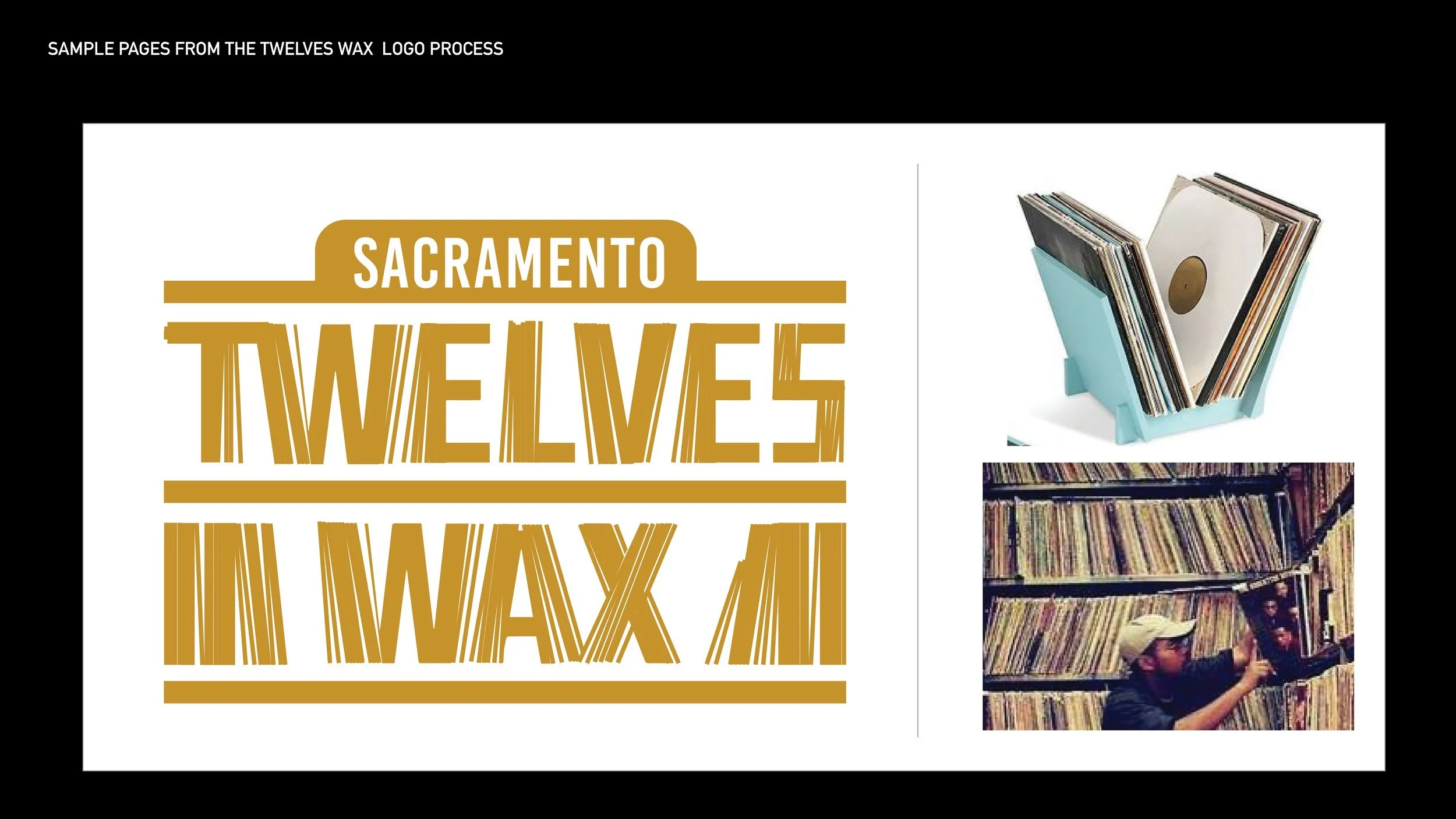
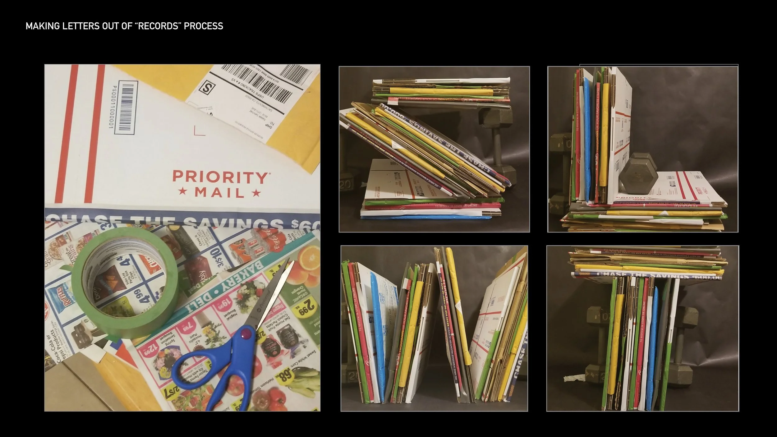
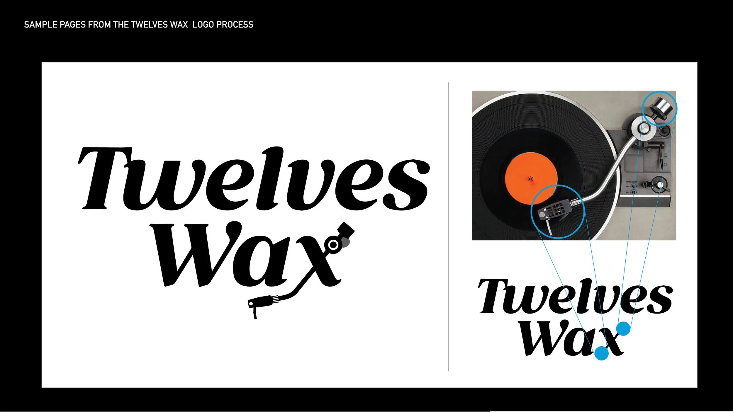
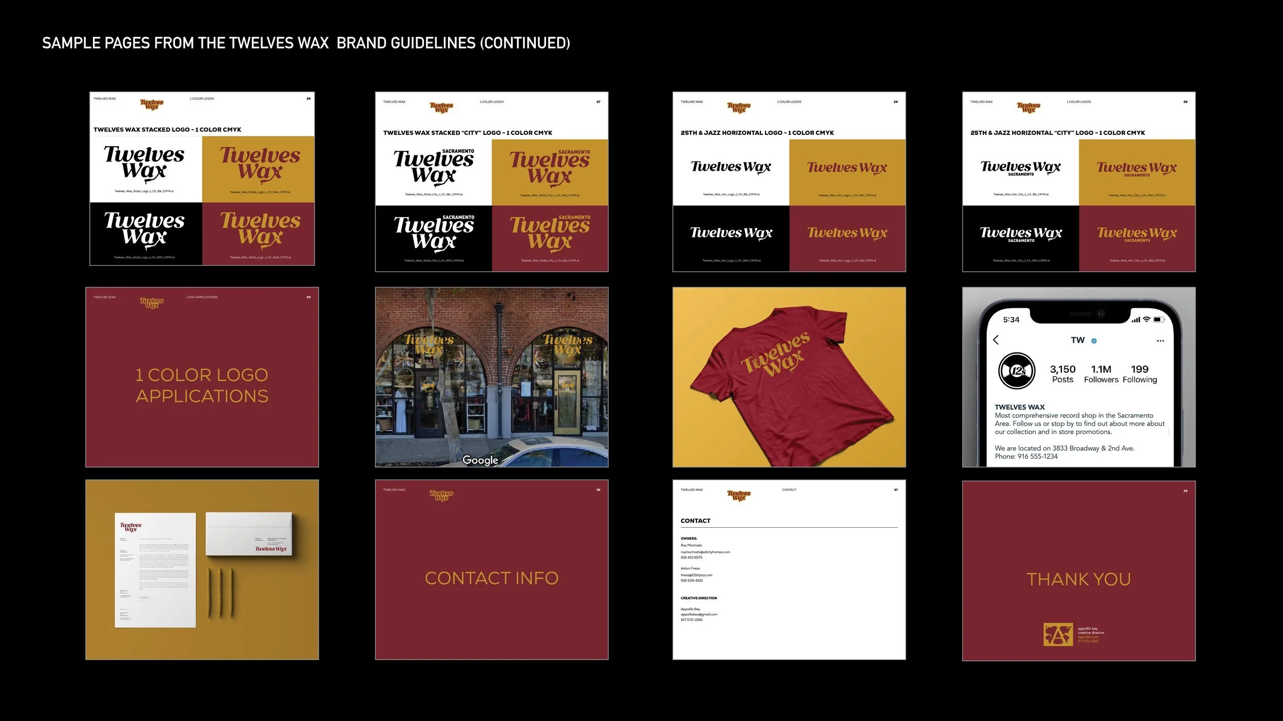
The design options include two directions, both of which are based on type. One explores the physical volume of records—how they are stacked and moved. How can we interpret the physicality of records into a logo? The idea was to draw inspiration from how records stack, leading to a typographic approach. I conducted a photo shoot using cardboard boxes, arranging them to create individual letters inspired by the physicality of records. The second direction considers the physical interaction people have with records. Recognizing the emotional connection to placing a needle on a record and listening to music, it was essential to include an option with a needle. Incorporating the needle and arm into the 'X' of the logo helps it connect with the store’s target audience. The clients chose the option featuring the record player needle. The next step was creating an icon representing the brand, inspired by records. The final design was a simple depiction of a record, with the number twelve in the center—an element from the store name—and easily recognizable as a symbol of the brand as a whole. Lastly, the signage combined both the icon and wordmark on the exterior. Other details included the store hours on the front doors. Altogether, these design elements create a cohesive and engaging branding experience for a vintage record shop located in Oak Park, Sacramento.
Major Personal Win
This project was meaningful to me because it was my first design project in Sacramento. I'm honored to be chosen to enhance the Oak Park skyline with some of my branding.
Project Role
Creative Director
Appolllo Bey
Twleves Wax Brick & Mortar

Twleves Wax Identity Design

Twleves Wax Logo Process

Twleves Wax Brand Guidelines

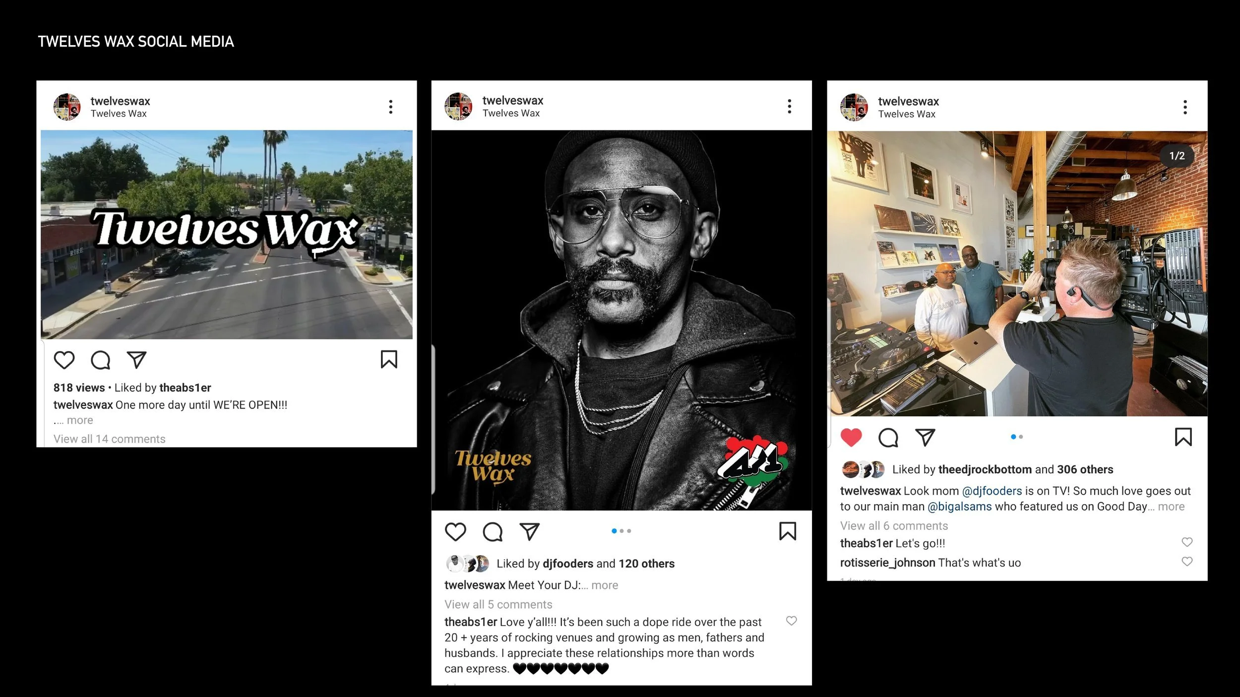
Twleves Wax Social